Does science have a font?
Sari van Anders
September 11, 2013
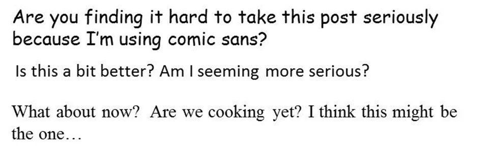
[Image with the following text: In Comic Sans: Are you finding it hard to take this post seriously because I'm using comic sans? In Arial: Is this a bit better? Am I seeming more serious? In Times New Roman: What about now? Are we cooking yet? I think this mght be the one…]
Back when the Higgs boson results from CERN were being reported, there was a major/minor tempest in a teapot about the font used by some scientists in their presentations. The discussion actually made it into New Scientist, and even the Guardian! And that font? Comic Sans.
We could debate whether Comic Sans should ever be used for legitimate purposes (not that comics aren’t legitimate) but far more interesting to Gap Junction Science is why the font would matter at all. Isn’t science culture-free and value-neutral? (‘Culture-free and value-neutral’ is obviously the feminist science ironic homage to ‘footloose and fancy-free.’) Why should the font affect whether we value the science, believe the results, or take the findings seriously? Another way to put it is: if Comic Sans is the wrong font, does science have a right one?
It’s an officially flabbergasting question: ‘does science have a right font?’ To be honest, I wouldn’t report my findings in Comic Sans, and obviously ‘Showcard Gothic’ is out… but would Arial be ok? What about Calibri? No, just Times New Roman? More importantly, where do we draw the line, and why? Clearly, the font – the tone! – affects the way people see science, or at least the legitimacy of science. Which is strange, to say the least, if science is science full stop.
It seems obvious that there are proper ways to do science, which includes reporting one’s scientific findings, which includes the font in one’s presentations. But thinking that something is obvious or feels right (or wrong) doesn’t actually make it so. For example: It’s obvious to me that chocolate croissants are inherently better than almond ones, but that doesn’t make for natural law. Or, I feel that putting the colors pink and orange together is inherently wrong, but my feelings don’t a universal truth make (unfortunately).
Equally importantly and even more relevant to feminist science, is the analogy; is it really just the font that can afford legitimacy or make us question it? Or might other factors affect the way that science is heard, understood, believed, or valued? Like, what about, hmmm… the scientists themselves? Their social locations? What about their clothes? Voices? What about when they upend their sentences? If people feel like there’s a right font for science (and Comic Sans isn’t it), it certainly is no leap to imagine that there are other features people think of as somehow more intrinsically and ineluctably ‘right’ for scientists. Comic Sans may seem like a silly diversion from Science but, as a metaphor, it’s pretty serious.
(note: thanks to Greg van Anders for bringing this point up!)